By LESLIE COLLINS
Northeast News
October 16, 2013
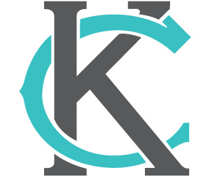
Kansas City is rebranding itself in the form of a new logo.
City officials unveiled the re-redesigned logo during an Oct. 10 launch party at The Bauer.
Kansas City’s previous logo, a heart-shaped fountain, had been marketed for at least 20 years.
“Kansas City is once again on the cutting edge of innovation,” Kansas City Mayor Sly James said during the event. “We’re learning we need to be building a city for the next 30 years, not the last 30 years.”
Launching a logo is part of that initiative.
“It’s a big deal for all of us,” he said.
James said the logo, which features a “K” wrapped around a “C,” is a brand that “unites us.”
It represents a city that’s young, exciting, vibrant and cutting edge, he said.
Designed pro bono by Emily Elmore of Single Wing Creative, the logo draws inspiration from the former Kansas City Monarchs logo and from the dogwood emblems at city hall, Elmore said.
“It’s classic and new at the same time,” she said.
Her favorite part about the logo is that it’s open source, she said.
“You can use it for anything,” Elmore said.
The logo is available in several sizes and colors at http://thenewkc.com.
“We encourage the entire community to embrace it and use it as much as you can. Please use it liberally,” James said.
For Bob Kendrick, president of the Negro Leagues Baseball Museum, the logo is the perfect way to represent Kansas City.
“With the inventing of this logo,” Kendrick said, “I think the world’s going to take notice of what Kansas City is really all about.”
