Northeast News
Aug. 30, 2014
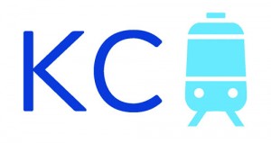
KANSAS CITY, Missouri — The Kansas City Streetcar Authority have revealed the name and branding for the downtown streetcar line.
According to a press release, the authority selected a “classic look and feel that is immediately recognizable and achieves world class standards for transit branding.” Streetcar Authority board members approved the branding package during its monthly public meeting on Thursday, Aug. 28.
“The name, ‘KC Streetcar’, is simple, intuitive and universal, giving Kansas City a place among the best transit systems in the world,” Tom Trabon, Streetcar Authority Board Chairman, said in the press release.
Willoughby Design, Inc. presented the final recommendation for the streetcar identity, including the name KC Streetcar, an original brand icon, word mark, favicon, design system and color palette. The approach for the streetcar name and identity was inspired by a global audit of regional transit and streetcar identity best practices, notably the Utah Transit Authority, RATP in Paris, Transport for London and GVB in Amsterdam. At the meeting, Willoughby representatives described each of these system identities as “simple, functional, universal, intuitive and cohesive.”
“This branding and name allows us to move forward with regional collaboration, while also keeping the focus on the downtown streetcar line as a catalyst for economic development and improved linkage of downtown neighborhoods and job centers,” Tom Gerend, KCSA Executive Director, said.
Willoughby also presented test applications of the KC Streetcar’s core brand identity to the current website, collateral, social media, web banners, way-finding signage, conceptual promotional campaigns and the vehicle design. The interior color palette, cobalt blue and silver, and the exterior color palette, pearl, silver and graphite, were approved by the KCSA Board earlier this year.
