Elizabeth Orosco
Northeast News
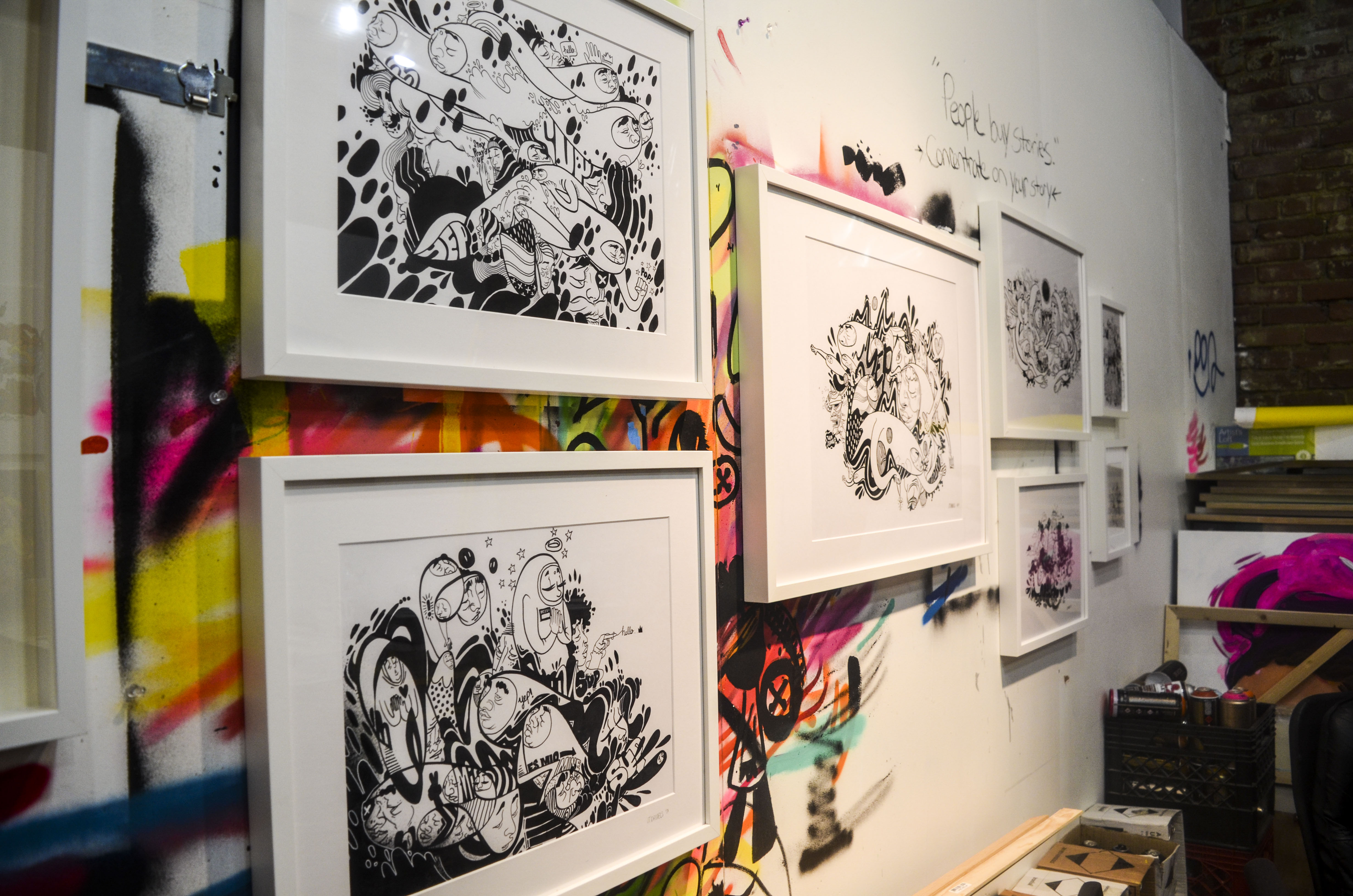
Cardboard boxes of bright-colored spray cans line the bottom of the west wall, sitting just below a row of framed black-and-white illustrations. The wall, covered in neon spray paint, bears the handwritten phrase “People buy stories. Concentrate on your story.”
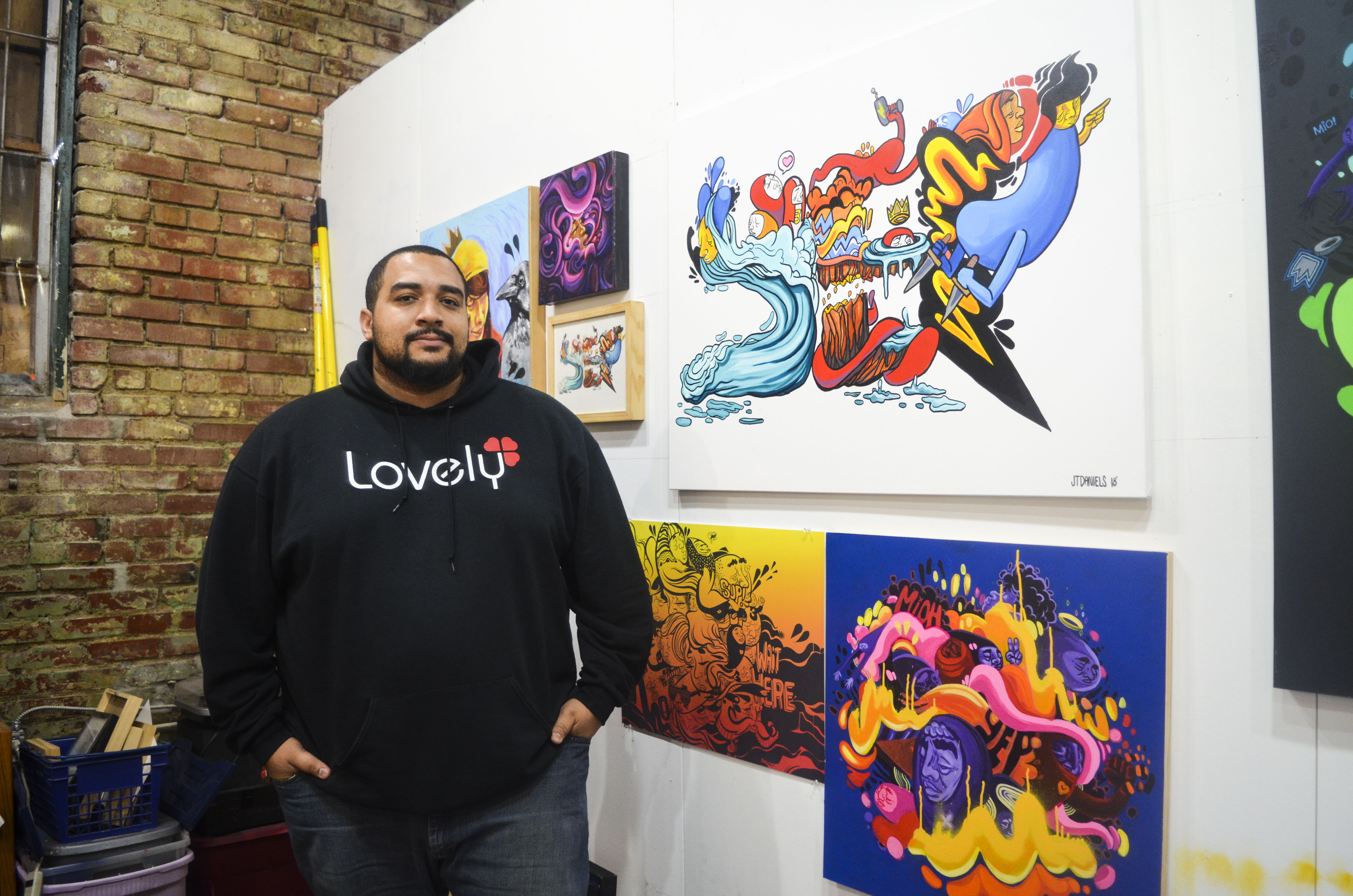
JT Daniels’ art studio sits across the street from the Kansas City Star in the heart of Downtown KC.
He has been part of the Kansas City community all his life, graduating from Wyandotte High School and receiving his Bachelor’s Degree in Studio Art from Park University in 2011. With eight selected solo exhibitions, 10 group exhibitions, over half a dozen murals in the KC area, and one of 10 artists to be selected by Brisk to rebrand their drink flavors, JT’s fingerprints can be seen all across the city.
He began creating art when he was young, with older cousins helping him learn to draw. His father encouraged him to link up with other local artists to learn and hone his craft. As the years progressed, JT became increasingly serious about his work, and decided to attend Columbus College of Art and Design. He spent a year there in what he likened as “artist bootcamp,” concentrating on his artwork 100 percent of the time.
JT eventually transferred to Park University in Parkville, Missouri. Fully focused, he utilized the 24-hour studio space and made it his home.
His solo exhibition “No Sleep Till…” at the Campanella Gallery had a record-breaking turnout of students and staff. It was also the first time the university had purchased a piece of art from a student.
After graduating, he designed CD covers and T-shirts for local Kansas City band “Making Movies.”
He was then hired at the Mattie Rhodes Center, working with the Mural Arts Program Inspiring Transformation (MAPIT). The program centered on the belief that art has the power to serve as an agent for benevolent social change, transforming neighborhoods and preserving property by implementing collaborative educational art projects to empower youth.
JT reminisced about a moment where he was driving down Independence Avenue and noticed a wall located off Norton Avenue he thought would be a great place for a mural. Six months later, money from a grant came in and he was offered the chance to collaborate with other artists and paint a mural on Independence Avenue– the same wall he had seen previously.
The mural, “Spirit of Community,” was painted in 2013 and sits on the southeast corner of Independence Avenue and Norton Avenue, facing eastbound traffic. The phrase “ A kingdom divided against itself cannot stand” is written in large white block letters. Faces from various cultures sit inside a compass-like diamond.
JT remained with Mattie Rhodes for the next few years working with the MAPIT program to get kids in the community engaged in art.
Today, JT works in Johnson County as an Art Specialist for adults with varying mental disabilities. He helps run the studio space and assists each individual artist grow in their own personal careers.
“I help them find the best route possible to be the most profitable at what they do, to have the best opportunities, and to work towards as much independence as possible,” said JT.
While he knew art was his passion, JT said he struggled throughout his career with what his work was bringing in financially.
After staying up one night with his youngest child who was just born, he wrestled with the idea of giving it all up. He made a list to get rid of his studio space and to sell all the supplies and equipment inside.
The same day, however, he was offered a project that he said was the catalyst to his current success as an artist.
He received an email from Brisk, the tea and juice brand managed by PepsiCo, offering him a spot to help design the label for one of their 10 beverages. The company had followed him on social media and became interested in his designs. With nine artists lined up, he would be the tenth and final link to work with the rebranding.
After being flown to New York and speaking with the representatives of the company, JT said he was on board with the opportunity and wasn’t given any suggestions on how to create his sketches.
“They just looked at me and said ‘We just want you to do what you do.’”
Two months later, he had designed the sketches. He said this moment propelled him into one of his hardest working years as an artist.
“I think the idea that someone liked my work and they like what I do was super great,” he said. “I didn’t apply for this project; they found me. It made things click for me as an artist. I told myself I would just shoot for the stars and see what happens.”
While he received his degree, JT said there was an art business side that was missing from his education, so he applied for and was accepted into the Artist INC program, a training seminar that addresses the specific business needs and challenges artists of all disciplines face. Limited to 25 participants per session, artists gather for one night a week for eight weeks to learn business skills specific to their art practice and apply those skills cooperatively with their peers. He said this really gave him the blueprint on how to run a business as an artist.
JT said creating art in Kansas City is all about collaboration.
“There are so many opportunities to do stuff that it’s really open. If you want to make a living being an artist, I’m not going to say it’s not hard, but you have to be an opportunity seeker. If you really chose to do that, it’s open for that.”
He said businesses in the area are also starting to become more open to the idea of having artwork displayed on the outside of their buildings.
“A lot of people are starting to understand that the creative aspect of that is financially viable and are now realizing, hey, it makes my business look better and it’s entertaining to people, but it’s also a way to help my city and help people around me, and it brings in more business.”
He recently painted the outside of Betty Rae’s Ice Cream at 412 Delaware, and was given artistic freedom with the design. He chose to keep the brown color of the building to look like ice cream dripping down onto the painting.
When asked about his distinct design with the faces of his characters and the phrases he incorporates into his work, JT said it all has a meaning.
“Yep” and “Sup” are seen in many of his illustrations and paintings. He said “sup” is his way of saying “surviving under pressure,” and that is something anyone of any walk of life can relate to. “Yep” is something he said his grandfather would always say in response to anything. Taking it a little deeper, JT looked it up in the dictionary and said he loved the way it wholly encompasses the word ‘yes,’ but with a little more passion.
“I started adding phrases into my artwork. They’re cultural aspects I want to include, to make them feel even more real, like they’re connected to something.”
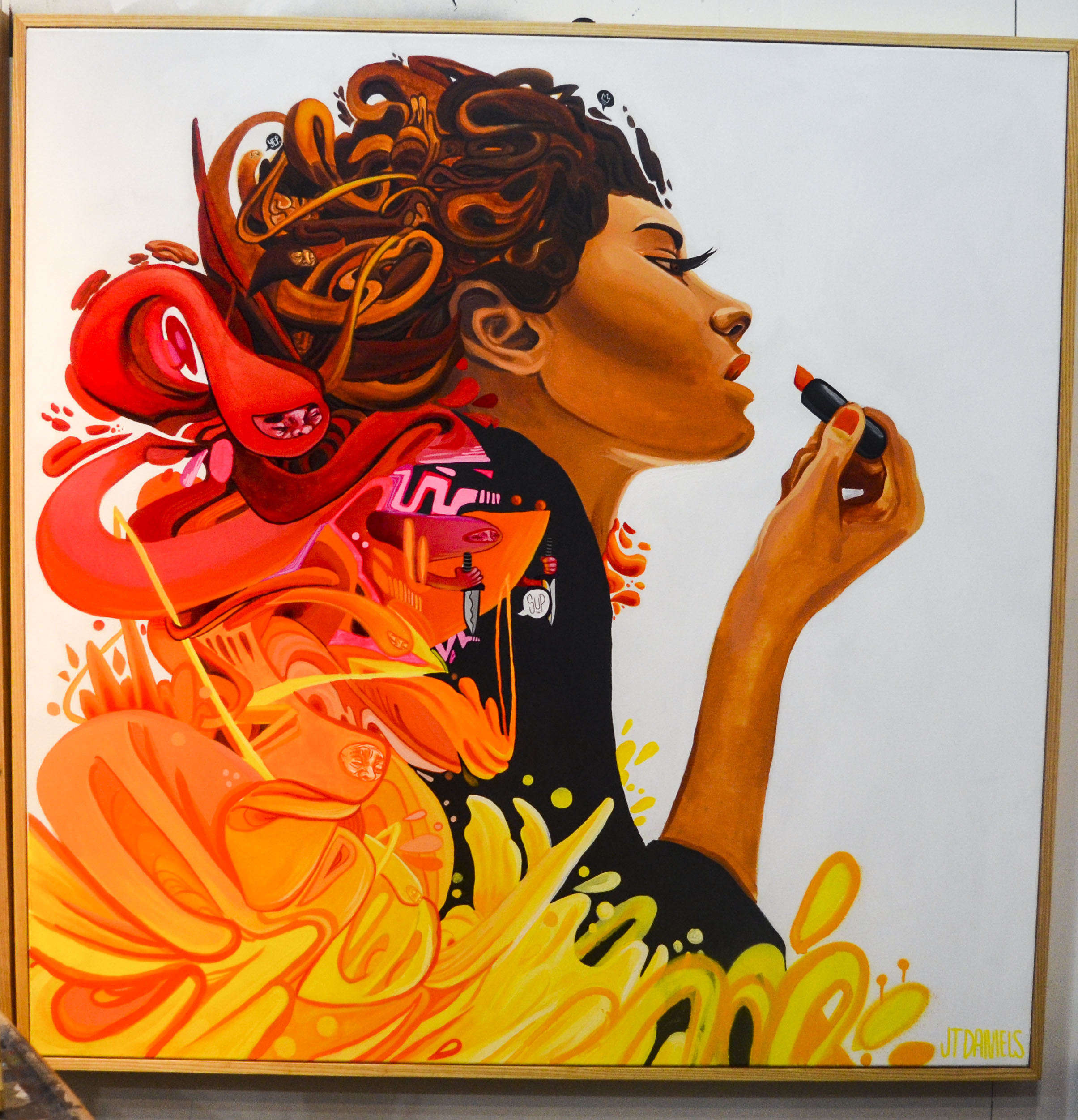
The distinct floating characters seen in a lot of his work is the result of him finding and honing his craft as an individual artist.
“I started creating these characters thinking that everyone kind of has their thing. I have all these thoughts going around and I have this energy floating around so I just turned it into these ghost-like characters and they become part of the tentacles or hair strands.”
With several local murals under his belt, JT said there is a lot of thought process that goes into creating a mural from concept to completion. He said he takes into consideration what the spot looks like, what the wall looks like, what business is it for and who is going to be around and receive his work.
“You can do a great piece of artwork, but if the community doesn’t like it, they can request that it be painted over,” he said. “In order for a piece of art to be great and to live on, the business has to be happy with it but I also have to convince them that whatever I’m giving them is usually putting their best foot forward.”
Last year, JT created “Charlie Parker’s Mood” next to the Gem Theatre in the 18th & Vine District. The mural is a tall, vertical silhouette of Charlie Parker playing the saxophone, surrounded by clouds of color. He said he already had this design in mind and decided to illustrate the idea of sound-to-color synesthesia, the perceptual phenomenon in which heard sounds automatically and involuntarily evoke an experience of color.
“When people see this, I thought about what colors are they going to see, does it do the business right, and will people like it when they go by,” he said.
With several more projects in the making, Daniels said he is looking forward to what the future holds and what projects he will have the opportunity to work on in 2019.
To see more of JT Daniels’ work, visit jtdanielsart.com and follow him on social media at @jtdaniels_art on Instagram and Twitter.